Generate Chart
This page describes chart generation for Classic projects.
Use this page to understand how Wren AI generates charts, how to refine them, and how to save or pin them for later use.
Automatic chart generation
When you ask a question, Wren AI analyzes your data and automatically generates the most appropriate chart type to visualize the results. Simply click the "Chart" tab to see the chart.
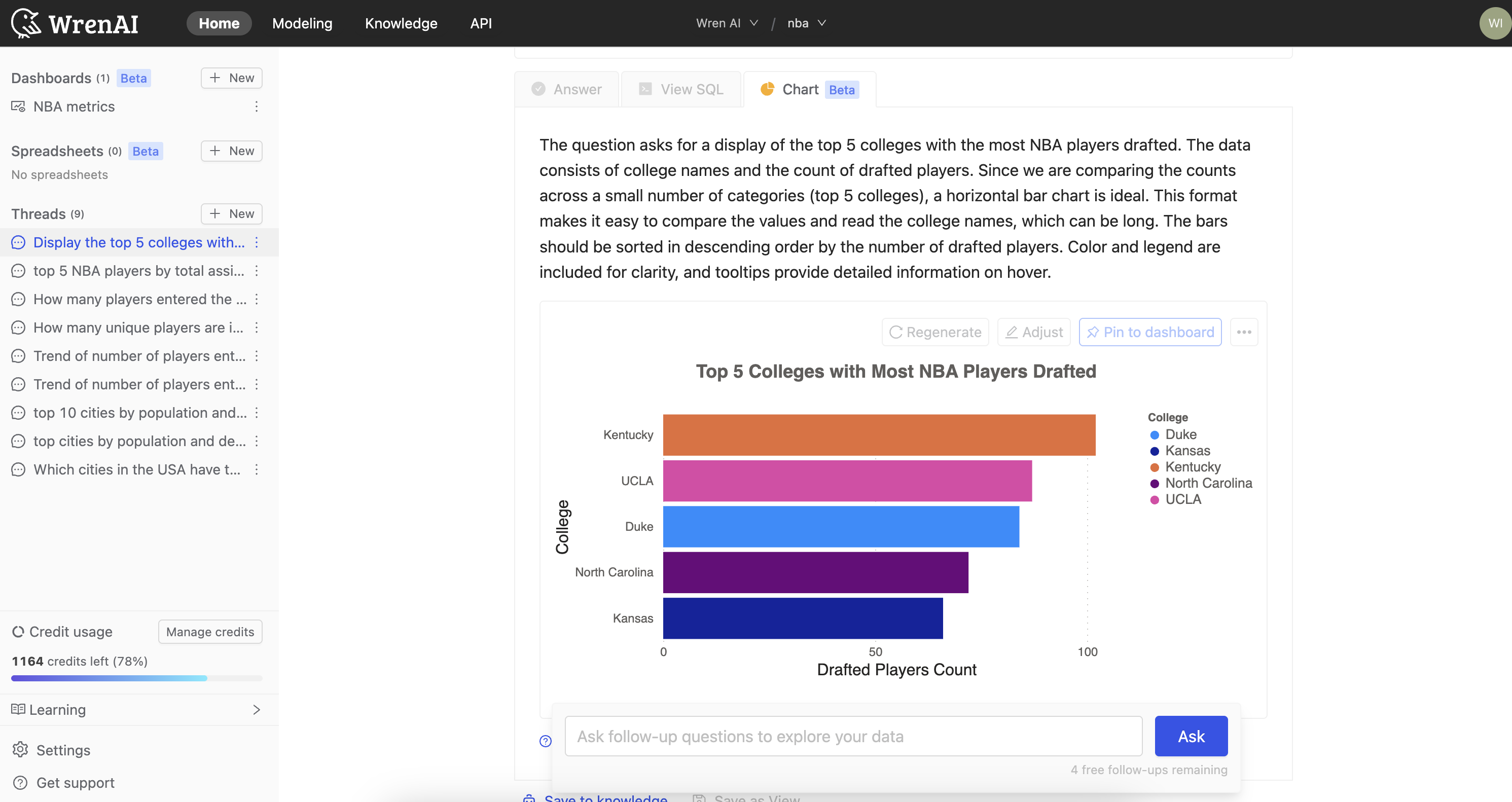
Chart gallery
Wren AI can generate a wide variety of chart types based on your data and requirements. Here are some examples of what's possible:
Basic Charts
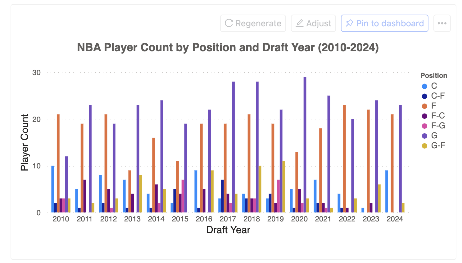
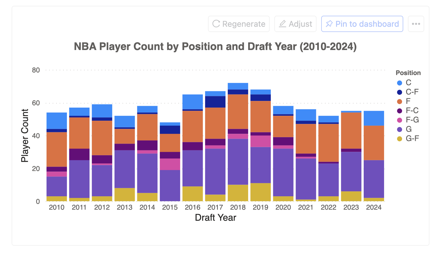
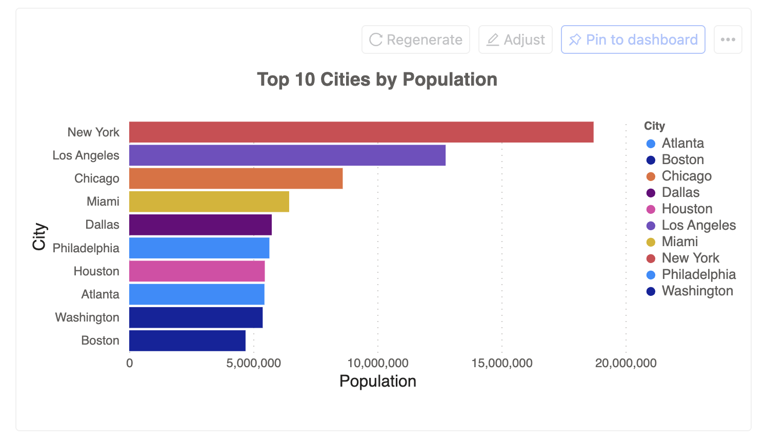
Bar Charts
Perfect for comparing quantities across categories.
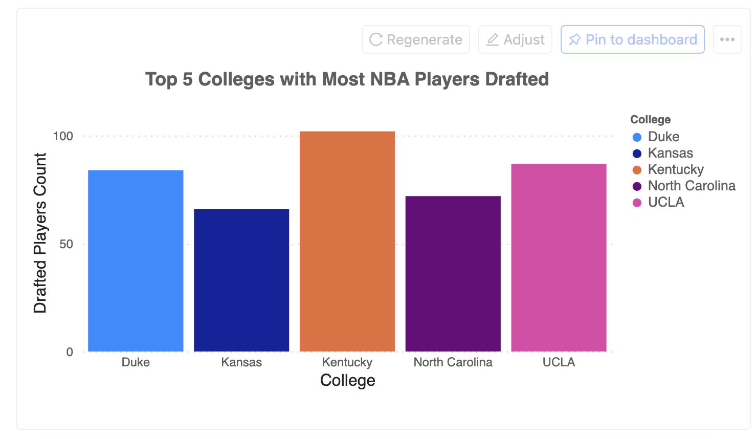
Other variations:
- Grouped bar charts for comparing sub-categories
- Stacked bar charts for showing composition
- Horizontal bar charts for long category names
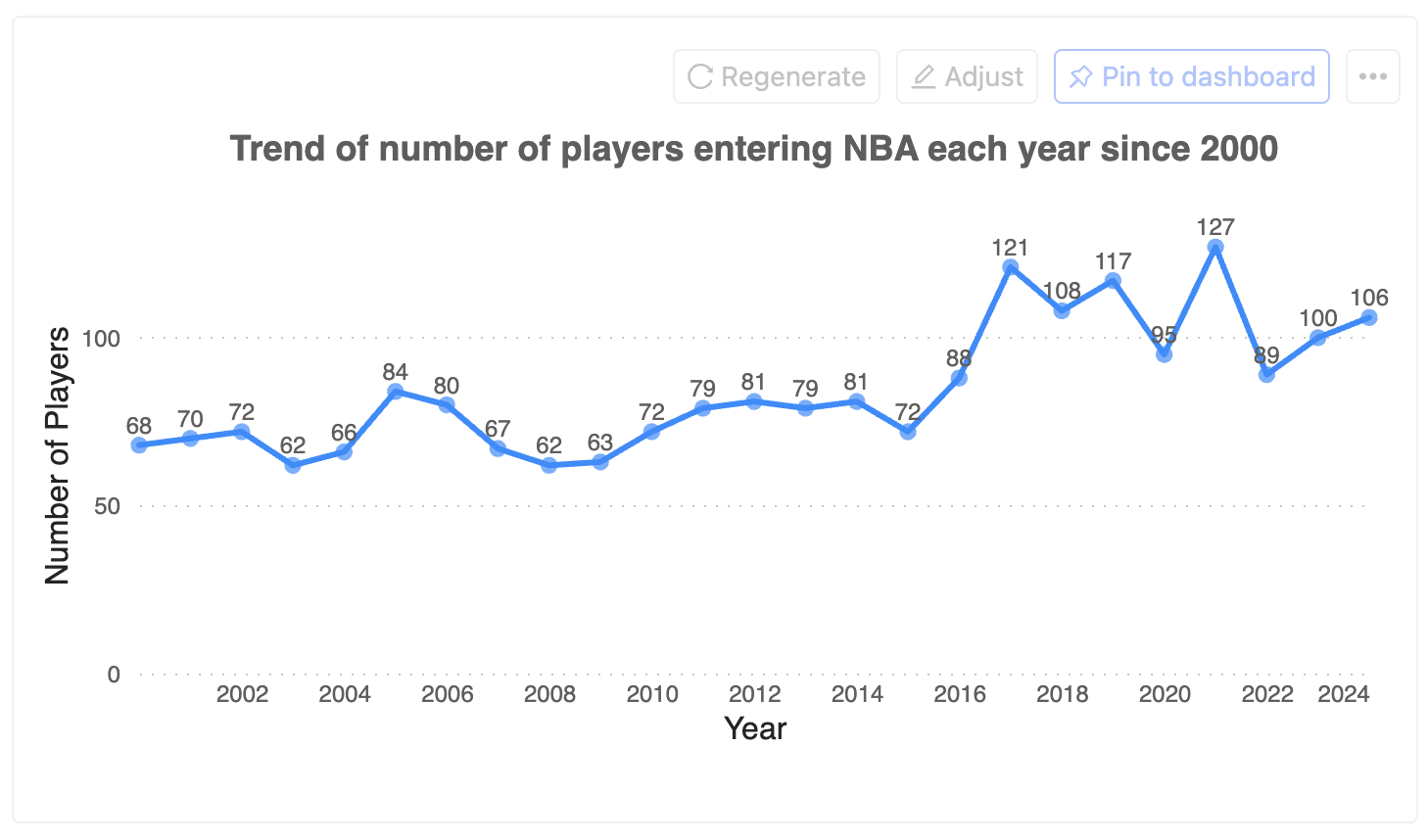
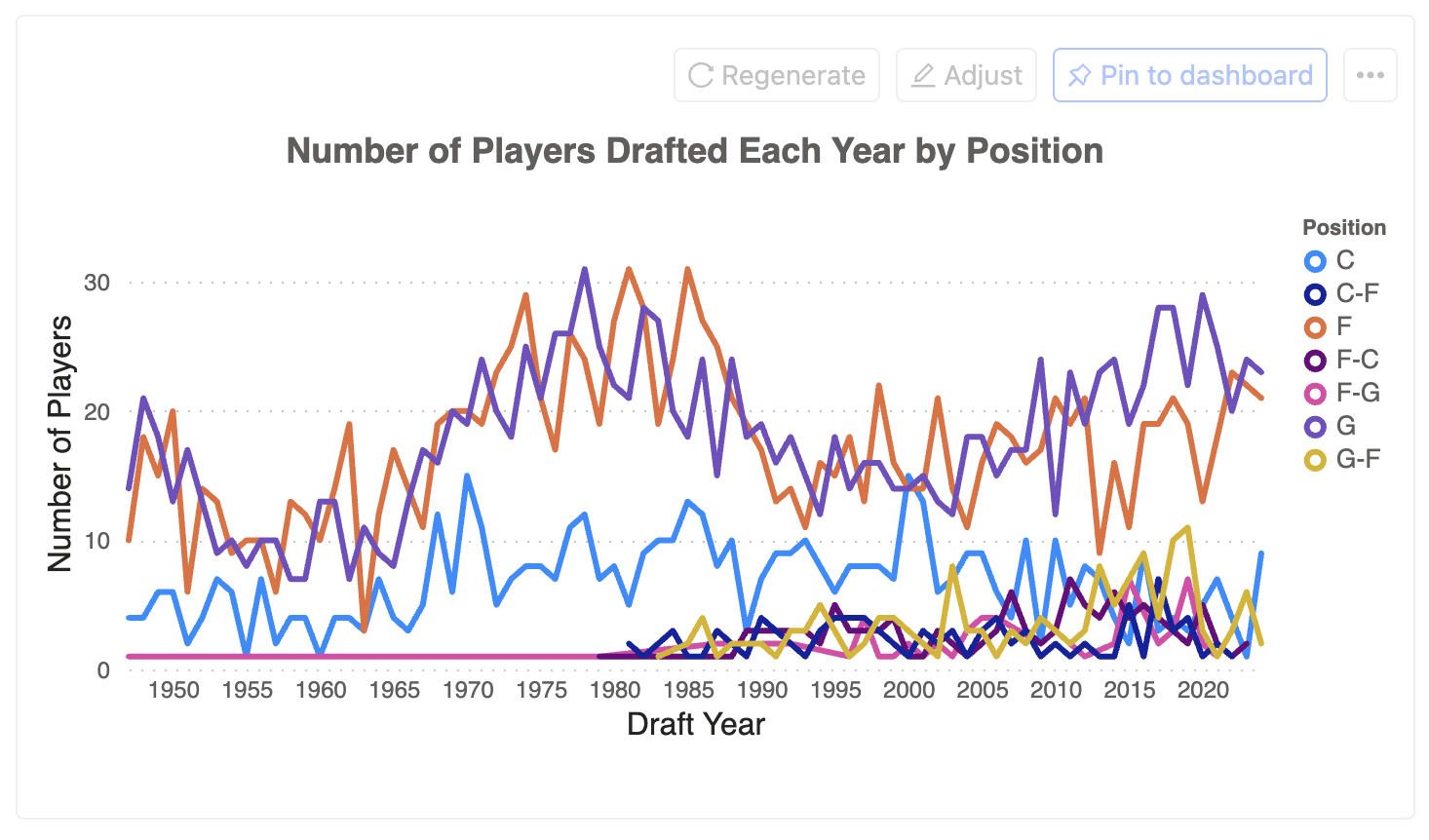
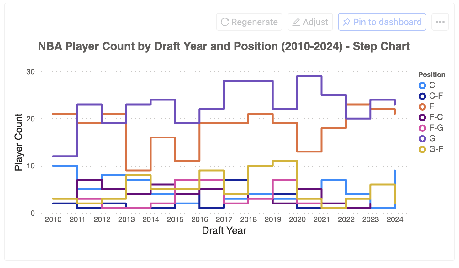
Line Charts
Ideal for showing trends and changes over time.
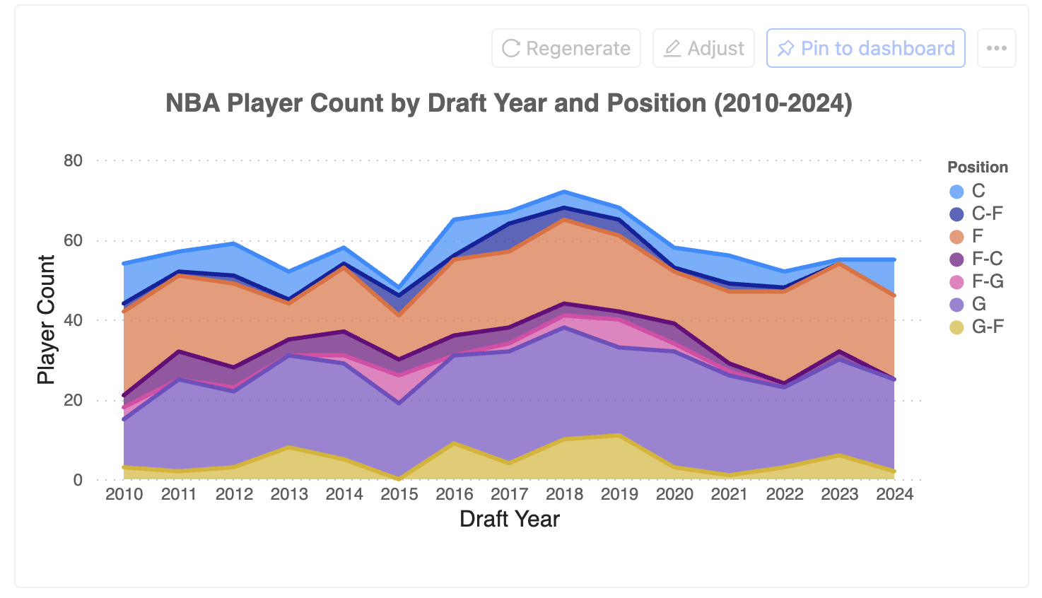
Other variations:
- Multi-line charts for comparing multiple trends
- Area charts for emphasizing volume
- Step charts for discrete changes
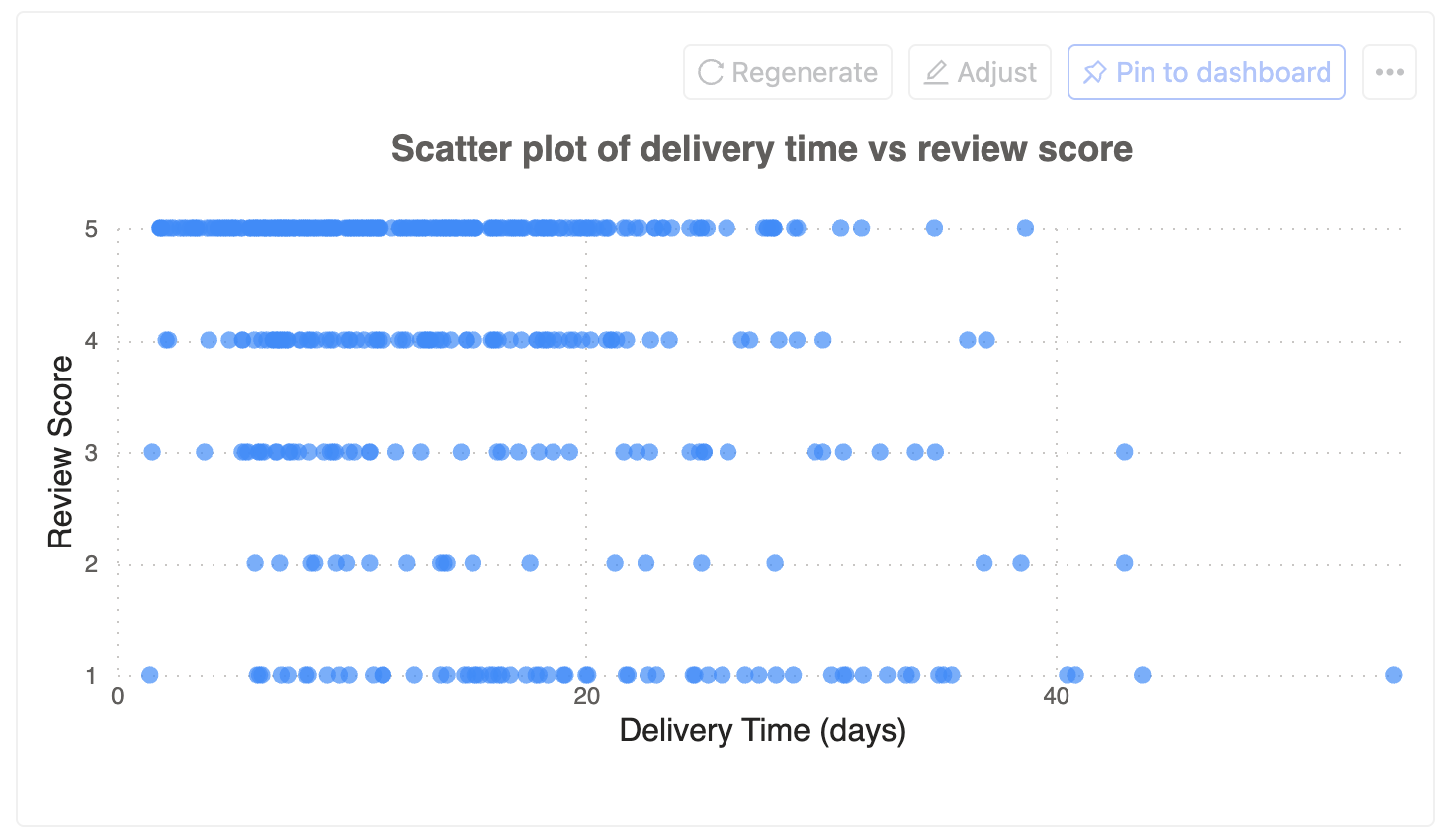
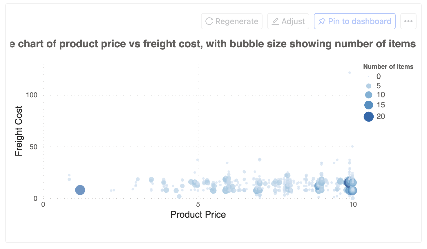
Scatter Plots
Great for showing correlations and relationships between variables.
Other variations:
- Bubble charts for adding a third dimension
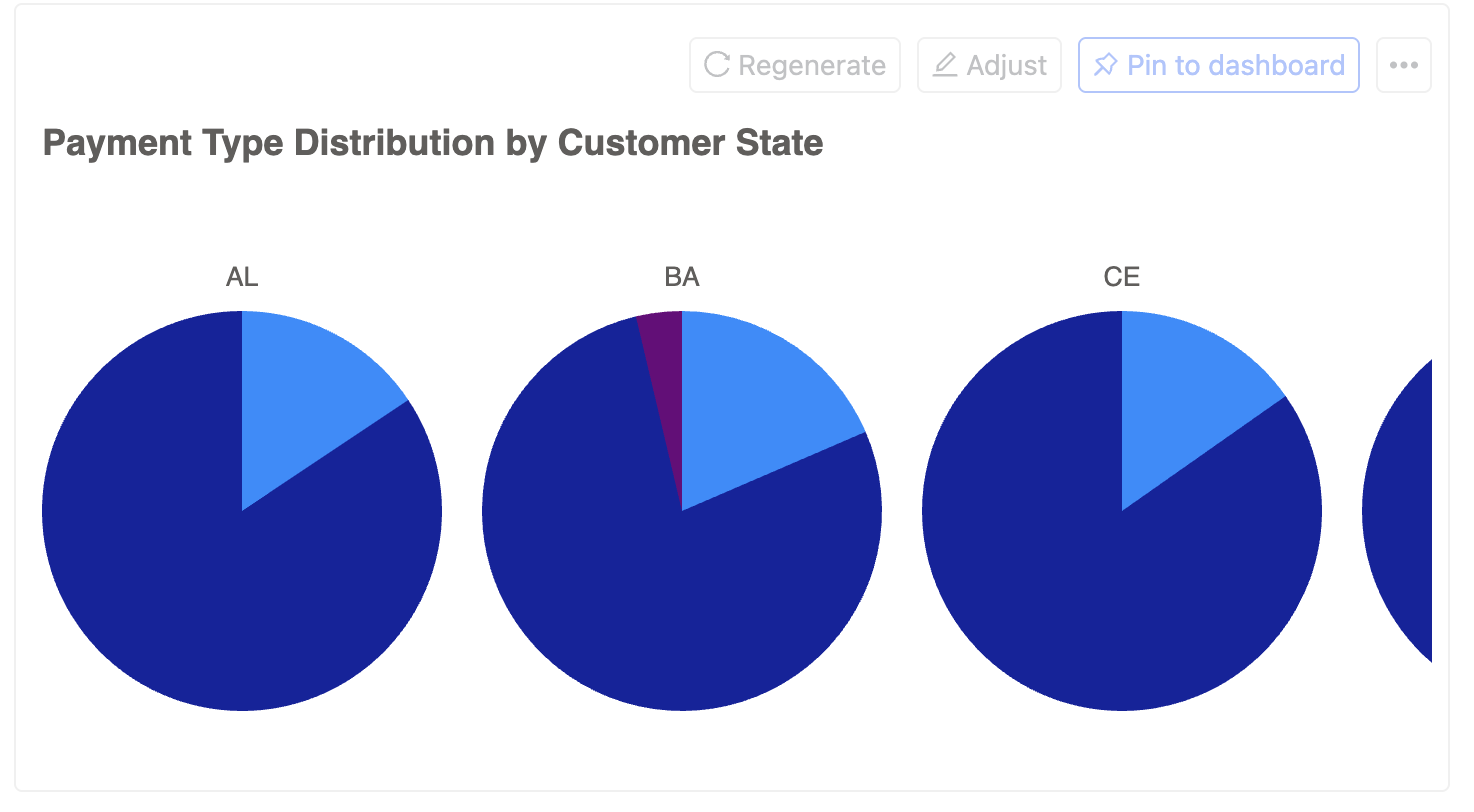
Pie Charts
Useful for showing proportions of a whole.
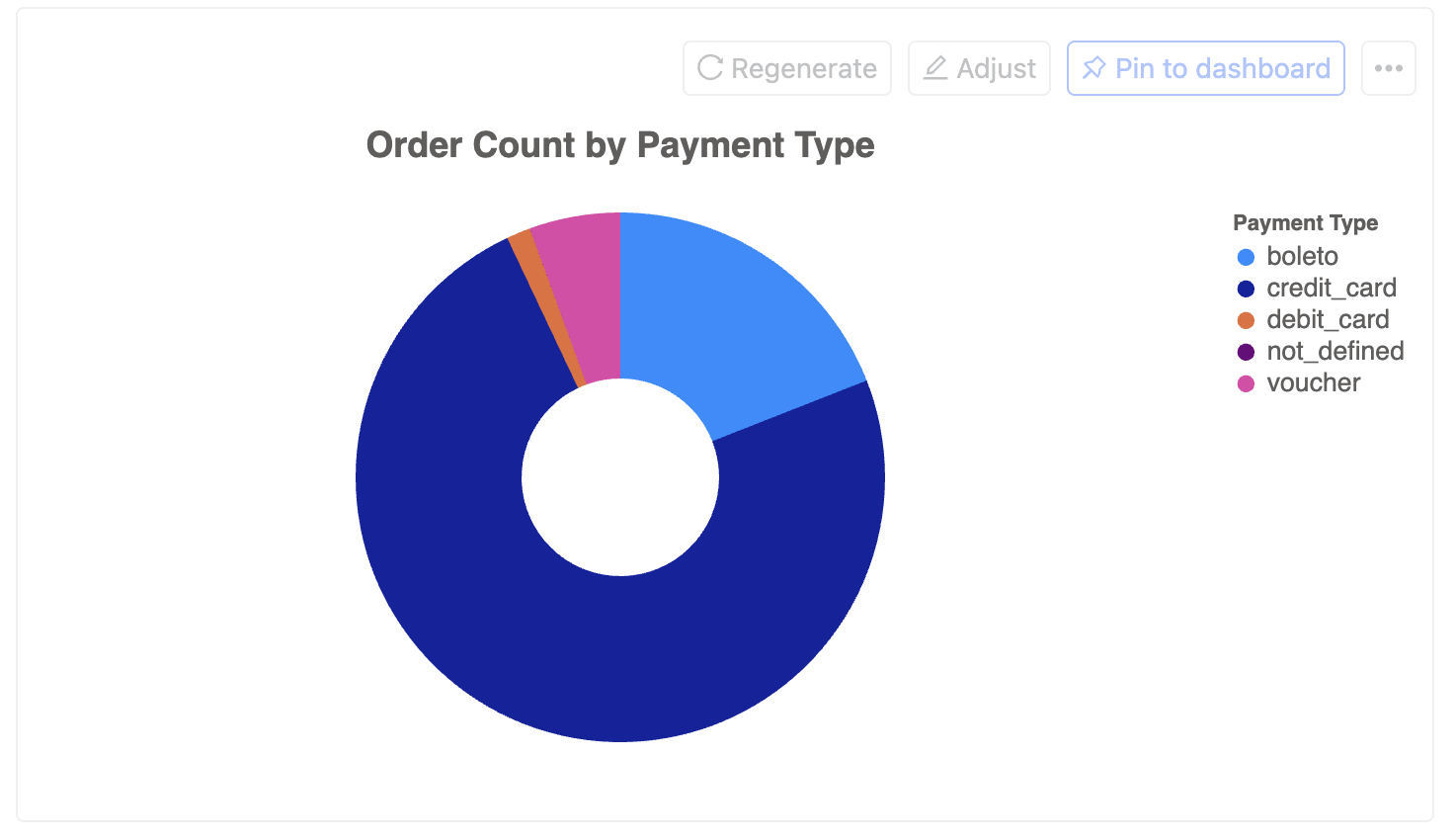
Other variations:
- Exploded pie charts for emphasis
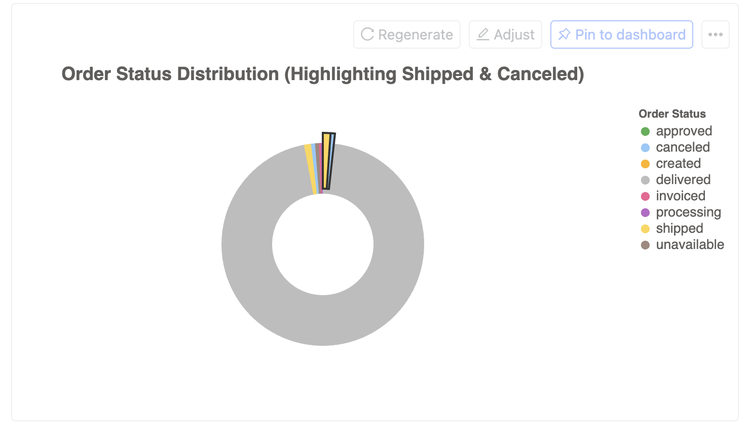
- Multiple pie charts for comparing multiple categories
Advanced Visualizations
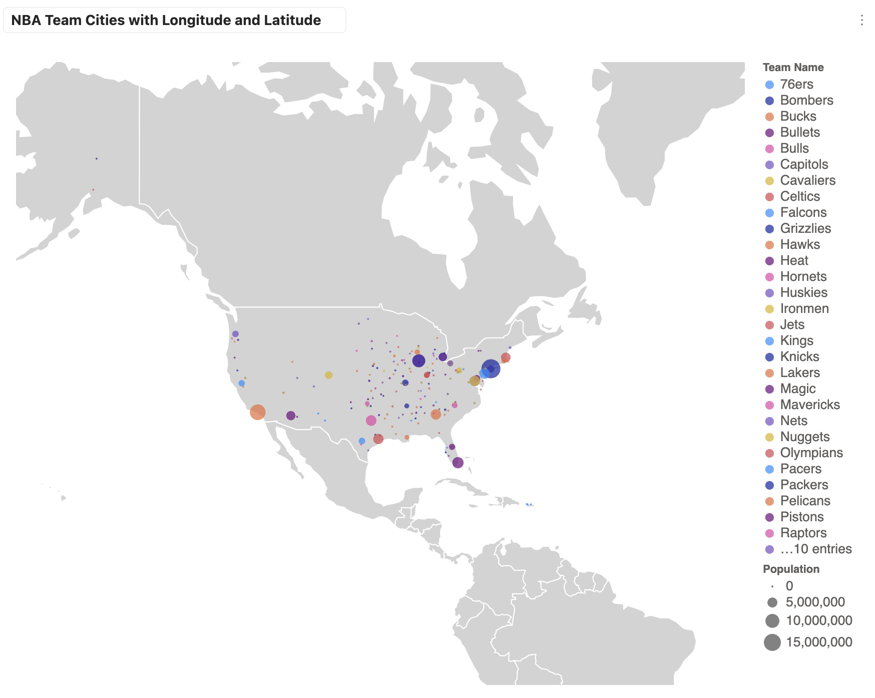
Maps
Perfect for geographical data visualization.
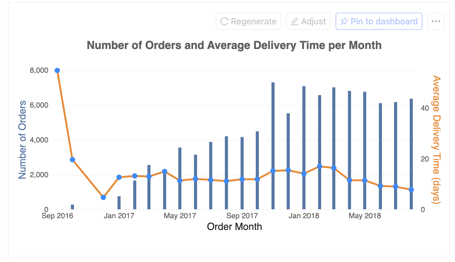
Mixed Charts
Combine different chart types for richer insights.
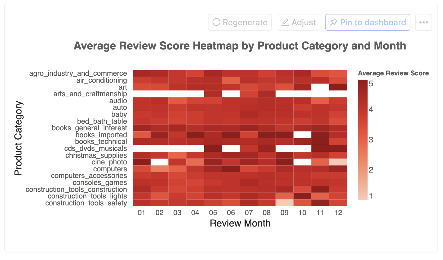
Heat Maps
Excellent for showing patterns and correlations in matrix data.
Metrics & KPIs
Display key performance indicators and important numbers.
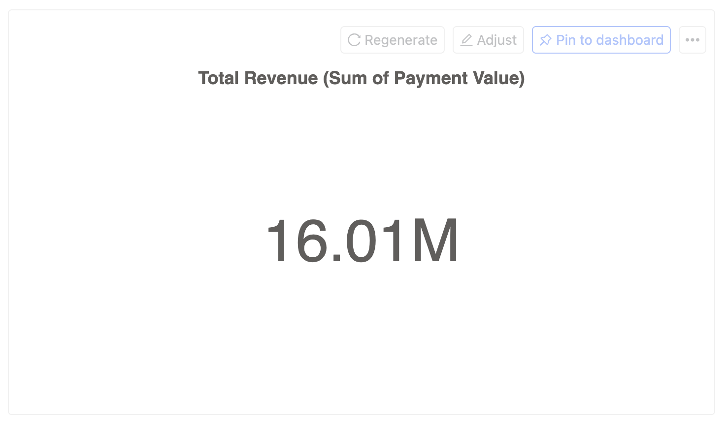
Chart types are not limited to the above examples. Wren AI supports any visualization that can be created using Vega-Lite.
Check out Vega-Lite examples for more inspiration.
Adjust the chart
You can adjust your chart using natural language. Simply describe the changes you want to make, and Wren AI will update the visualization accordingly.
Example 1: Style Changes
You can modify the chart's appearance using natural language:
- "Make the bars blue"
- "Increase the font size"
Example 2: Data Visualization Enhancements
Add more information to your chart:
- "Add data labels above each point"
Example 3: Chart Type Transformations
Transform your chart into a different visualization:
- "Convert to a side-by-side bar chart with shared y-axis"
- "Show this as a stacked area chart"
- "Create a dual-axis chart with line and bar"
- "Display as a heat map"
Regenerate the chart
If you're not satisfied with the chart, you can regenerate it by clicking the "Regenerate" icon.
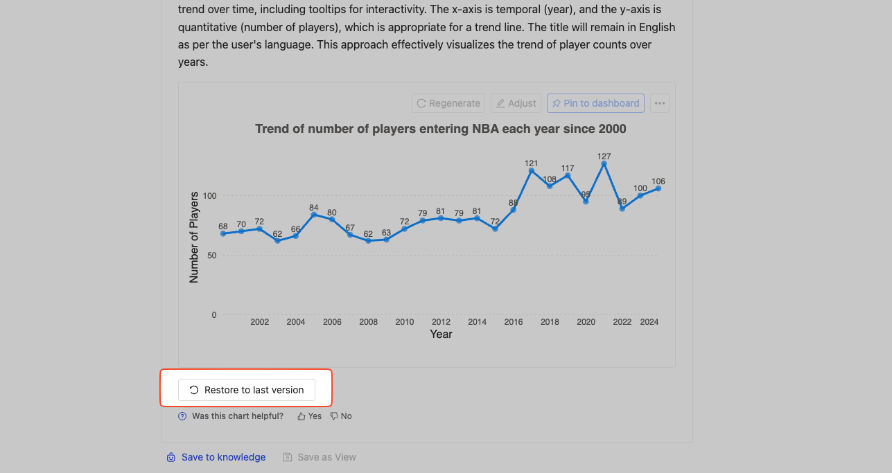
Restore the last version
If you're not satisfied with the changes, you can click the "Restore to last version" button at the bottom of the chart to revert to the previous state.
Reset the chart
If you want to start over, you can click the "Regenerate" button.
Save the chart
You can save the chart by clicking the "More" icon. We support downloading the chart in PNG and SVG formats.
Pin to dashboard
You can pin the chart to your dashboard by clicking the "Pin to dashboard" button.